How to Build a Social Sharing Component in Next.js and Tailwind CSS

Table Of Contents
- How to Build a Social Sharing Component in Next.js and Tailwind CSS
- Prerequisites:
- Step 1: Set Up Your Next.js Project
- Step 2: Install React Icons
- Step 3: Create the Share Button Component
- Step 4: Add Social Media Sharing Logic
- Adding Share Logic
- Step 5: Adding Icons and Styling the Share Menu
- Step 6: Tailoring the Design with Tailwind CSS
- Step 7: Test and Customize
- Final Code
- Related Articles
- Conclusion
In this tutorial, we will create a social media sharing component using Next.js and Tailwind CSS, featuring icons for each social platform and a responsive design. We’ll walk through building the component step by step, covering state management, sharing URLs, and enhancing the user experience with icons.
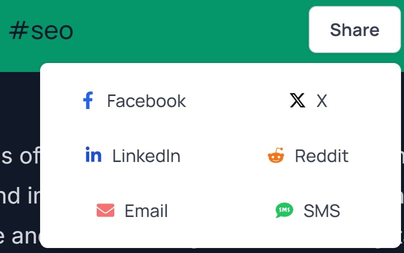
The final code can be found below or by clicking here.
How to Build a Social Sharing Component in Next.js and Tailwind CSS
Prerequisites:
- Basic understanding of React (used in Next.js).
- Familiarity with Next.js for creating client-side components.
- Experience with Tailwind CSS for styling.
- Basic understanding of JavaScript fundamentals.
Step 1: Set Up Your Next.js Project
First, ensure that you have a Next.js project running. If not, you can create one quickly by running:
npx create-next-app@latest my-share-component
cd my-share-component
Step 2: Install React Icons
We will use react-icons for the social media icons. To install it, run the following command:
npm install react-iconsThis library provides a wide array of icons from different platforms, which makes it perfect for our use case.
advertisement
Step 3: Create the Share Button Component
Let's begin by creating our ShareButton component. In Next.js, we typically create reusable components inside the components folder. So, create a new file inside the components directory named ShareButton.jsx.
mkdir components
touch components/ShareButton.jsx
Here's the skeleton of the ShareButton component:
'use client';

import { useState } from 'react';

const ShareButton = () => {
    const [isOpen, setIsOpen] = useState(false);

    const toggleMenu = () => {
        setIsOpen((prev) => !prev);
    };

    return (
        <div className="relative inline-block text-left">
            <button
                onClick={toggleMenu}
                className="inline-flex justify-center rounded-md border border-gray-300 shadow-sm px-4 py-2 bg-white text-sm font-bold text-gray-700 hover:bg-gray-50 focus:outline-none"
            >
                Share
            </button>

            {isOpen && (
                <div className="absolute right-0 z-10 mt-2 w-56 rounded-md shadow-lg bg-white ring-1 ring-black ring-opacity-5">
                    <div className="py-1 grid grid-cols-2 gap-2" role="menu" aria-orientation="vertical" aria-labelledby="options-menu">
                        {/* Add platform buttons here */}
                    </div>
                </div>
            )}
        </div>
    );
};

export default ShareButton;
Step 4: Add Social Media Sharing Logic
Now, let's add the logic to handle sharing on social media platforms. We'll use the window.location.href to dynamically get the current page URL, and for each platform, we will generate the corresponding sharing link.
We'll also handle different social media platforms like Facebook, Twitter, LinkedIn, Reddit, as well as options for Email and SMS.
Adding Share Logic
Update your ShareButton component to include sharing URLs:
const shareOnPlatform = (platform) => {
    const url = encodeURIComponent(window.location.href);
    const text = encodeURIComponent("Check out this article!");

    let shareUrl = '';

    switch (platform) {
        case 'facebook':
            shareUrl = `https://www.facebook.com/sharer/sharer.php?u=${url}`;
            break;
        case 'twitter':
            shareUrl = `https://twitter.com/intent/tweet?url=${url}&text=${text}`;
            break;
        case 'linkedin':
            shareUrl = `https://www.linkedin.com/shareArticle?url=${url}`;
            break;
        case 'email':
            shareUrl = `mailto:?subject=${text}&body=${text} - ${url}`;
            break;
        case 'sms':
            shareUrl = `sms:?&body=${text} - ${url}`;
            break;
        case 'reddit':
            shareUrl = `https://reddit.com/submit?url=${url}&title=${text}`;
            break;
        default:
            break;
    }

    window.open(shareUrl, '_blank');
};
This function generates a URL specific to the platform and opens it in a new tab using window.open(). The encodeURIComponent() ensures that the URL and text can safely be included in the sharing URL.
advertisement
Step 5: Adding Icons and Styling the Share Menu
Now let’s use the react-icons package to add icons for each platform. For this, import the necessary icons at the top of the file:
import { FaFacebookF, FaTwitter, FaLinkedinIn, FaEnvelope, FaSms, FaRedditAlien } from 'react-icons/fa';Update the share buttons with the icons and style them with Tailwind:
{isOpen && (
    <div className="absolute right-0 z-10 mt-2 w-56 rounded-md shadow-lg bg-white ring-1 ring-black ring-opacity-5">
        <div className="py-1 grid grid-cols-2 gap-2" role="menu" aria-orientation="vertical" aria-labelledby="options-menu">
            <button
                onClick={() => shareOnPlatform('facebook')}
                className="flex items-center px-4 py-2 text-sm text-gray-700 hover:bg-gray-100"
            >
                <FaFacebookF className="mr-2 text-blue-600" />
                Facebook
            </button>
            <button
                onClick={() => shareOnPlatform('twitter')}
                className="flex items-center px-4 py-2 text-sm text-gray-700 hover:bg-gray-100"
            >
                <FaTwitter className="mr-2 text-blue-400" />
                Twitter
            </button>
            <button
                onClick={() => shareOnPlatform('linkedin')}
                className="flex items-center px-4 py-2 text-sm text-gray-700 hover:bg-gray-100"
            >
                <FaLinkedinIn className="mr-2 text-blue-700" />
                LinkedIn
            </button>
            <button
                onClick={() => shareOnPlatform('email')}
                className="flex items-center px-4 py-2 text-sm text-gray-700 hover:bg-gray-100"
            >
                <FaEnvelope className="mr-2 text-gray-500" />
                Email
            </button>
            <button
                onClick={() => shareOnPlatform('sms')}
                className="flex items-center px-4 py-2 text-sm text-gray-700 hover:bg-gray-100"
            >
                <FaSms className="mr-2 text-green-500" />
                SMS
            </button>
            <button
                onClick={() => shareOnPlatform('reddit')}
                className="flex items-center px-4 py-2 text-sm text-gray-700 hover:bg-gray-100"
            >
                <FaRedditAlien className="mr-2 text-orange-500" />
                Reddit
            </button>
        </div>
    </div>
)}
Step 6: Tailoring the Design with Tailwind CSS
Here's a breakdown of the Tailwind classes used:
- Button styling: The main button has classes like
rounded-md,border,shadow-sm, andhover:bg-gray-50to create an accessible and clickable button. - Dropdown menu: We used Tailwind's grid-cols-2 to split the share options into two columns, improving the visual layout.
- Icon alignment: Each button has the
flexclass withitems-centerto align the icon and text horizontally.
Step 7: Test and Customize
At this point, you should have a fully functional sharing component that allows users to share your blog posts on various social platforms. You can further customize the styles, the list of platforms, or the text that is shared.

Final Code
'use client';

import { useState } from 'react';
import { FaFacebookF, FaLinkedinIn, FaEnvelope, FaSms, FaRedditAlien } from 'react-icons/fa';
import { FaXTwitter } from 'react-icons/fa6'

const ShareButton = () => {
    const [isOpen, setIsOpen] = useState(false);

    const toggleMenu = () => {
        setIsOpen((prev) => !prev);
    };

    const shareOnPlatform = (platform) => {
        const url = encodeURIComponent(window.location.href);
        const text = encodeURIComponent("Check out this article from Hooker Hill Studios!");

        let shareUrl = '';

        switch (platform) {
            case 'facebook':
                shareUrl = `https://www.facebook.com/sharer/sharer.php?u=${url}`;
                break;
            case 'twitter':
                shareUrl = `https://twitter.com/intent/tweet?url=${url}&text=${text}`;
                break;
            case 'linkedin':
                shareUrl = `https://www.linkedin.com/shareArticle?url=${url}`;
                break;
            case 'email':
                shareUrl = `mailto:?subject=${text}&body=${text} - ${url}`;
                break;
            case 'sms':
                shareUrl = `sms:?&body=${text} - ${url}`;
                break;
            case 'reddit':
                shareUrl = `https://reddit.com/submit?url=${url}&title=${text}`;
                break;
            default:
                break;
        }

        window.open(shareUrl, '_blank');
        setIsOpen(false);
    };

    return (
        <div className="relative inline-block text-left">
            <button
                onClick={toggleMenu}
                className="inline-flex justify-center rounded-md border border-gray-300 shadow-sm px-4 py-2 bg-white text-sm font-bold text-gray-700 hover:bg-gray-50 "
            >
                Share
            </button>

            {isOpen && (
                <div className="absolute right-0 z-10 mt-2 w-72 rounded-md shadow-lg bg-white ring-1 ring-black ring-opacity-5 p-2 mx-auto justify-center items-center ">
                    <div className="py-1 grid grid-cols-2 gap-2 mx-auto justify-center items-center w-full" role="menu" aria-orientation="vertical" aria-labelledby="options-menu">
                        <button
                            onClick={() => shareOnPlatform('facebook')}
                            className="flex items-center px-4 py-2 text-sm text-gray-700 hover:bg-gray-100 rounded-xl duration-300 justify-center text-justify"
                        >
                            <FaFacebookF className="mr-2 text-blue-600" />
                            Facebook
                        </button>
                        <button
                            onClick={() => shareOnPlatform('twitter')}
                            className="flex items-center px-4 py-2 text-sm text-gray-700 hover:bg-gray-100 rounded-xl duration-300 justify-center text-justify"
                        >
                            <FaXTwitter className="mr-2 text-black" />
                            X
                        </button>
                        <button
                            onClick={() => shareOnPlatform('linkedin')}
                            className="flex items-center px-4 py-2 text-sm text-gray-700 hover:bg-gray-100 rounded-xl duration-300 justify-center text-justify"
                        >
                            <FaLinkedinIn className="mr-2 text-blue-700" />
                            LinkedIn
                        </button>
                        <button
                            onClick={() => shareOnPlatform('reddit')}
                            className="flex items-center px-4 py-2 text-sm text-gray-700 hover:bg-gray-100 rounded-xl duration-300 justify-center text-justify"
                        >
                            <FaRedditAlien className="mr-2 text-orange-500" />
                            Reddit
                        </button>
                        <button
                            onClick={() => shareOnPlatform('email')}
                            className="flex items-center px-4 py-2 text-sm text-gray-700 hover:bg-gray-100 rounded-xl duration-300 justify-center text-justify"
                        >
                            <FaEnvelope className="mr-2 text-red-400" />
                            Email
                        </button>
                        <button
                            onClick={() => shareOnPlatform('sms')}
                            className="flex items-center px-4 py-2 text-sm text-gray-700 hover:bg-gray-100 rounded-xl duration-300 justify-center text-justify"
                        >
                            <FaSms className="mr-2 text-green-500" />
                            SMS
                        </button>

                    </div>
                </div>
            )}
        </div>
    );
};

export
default ShareButton;
advertisement
Related Articles
- Creating A Custom Breadcrumb Menu Component in Next.js
- Creating a Customizable and Reusable React Hook for Using Local Storage: A Step-by-Step Tutorial
- All JavaScript Articles
- All Tutorials
- All Guides
Conclusion
This tutorial showed how to create a shareable component in Next.js with Tailwind CSS and icons from react-icons. It dynamically generates shareable URLs and allows users to share content on Facebook, Twitter, LinkedIn, Reddit, via Email, and SMS. You can easily expand or customize this component to suit your specific needs.
Feel free to experiment by adding more platforms or customizing the share messages. This flexible and reusable component can enhance your website’s engagement and make it easy for users to share your content.
About the Author

Hi, I'm Jared Hooker, and I have been passionate about coding since I was 13 years old. My journey began with creating mods for iconic games like Morrowind and Rise of Nations, where I discovered the thrill of bringing my ideas to life through programming.
Over the years, my love for coding evolved, and I pursued a career in software development. Today, I am the founder of Hooker Hill Studios, where I specialize in web and mobile development. My goal is to help businesses and individuals transform their ideas into innovative digital products.
Read Recent Articles
Recent Articles
View All
CompressIt - Fast & Efficient Image Compression Tool for Web Optimization
December 02, 2024



to join the conversation